Visualization Map Types
Map Grafica editor allows users to make thematic maps, which are representations of attribute data (quantitative and qualitative) on a base map.
Visualizing data with maps involves making decisions in three basic areas: projection, scale and symbolization.
There is a vast literature on map making, and further readings are strongly recommended.
-
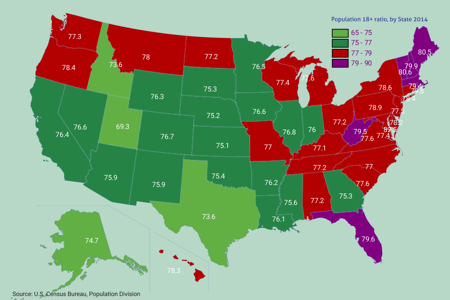
Choropleth - thematic data visualization map using a Qualitative color scheme.
-
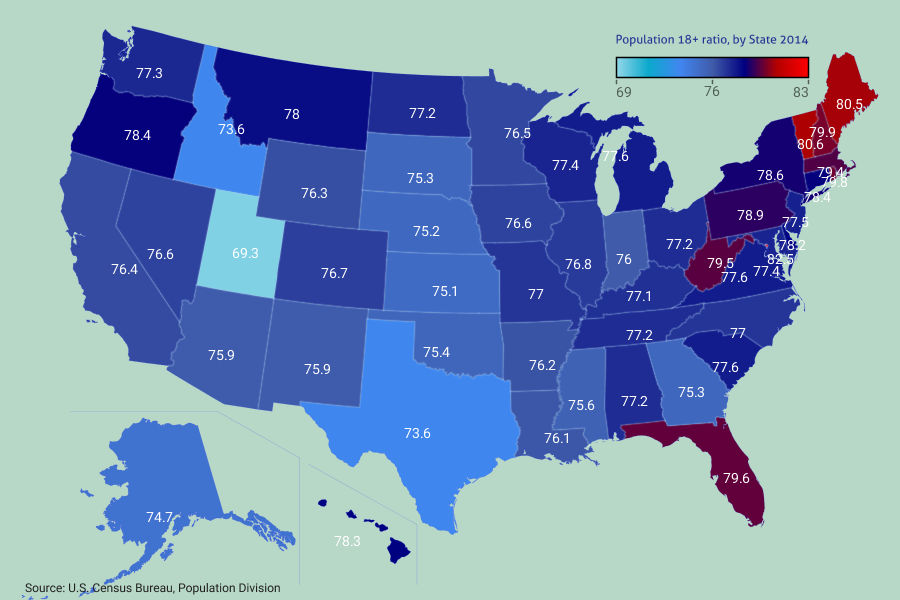
Choropleth - thematic data visualization map using a Sequential color scheme.
-

Bubble maps using a single data set.
-

Bubble maps created with multiple data sets.
-
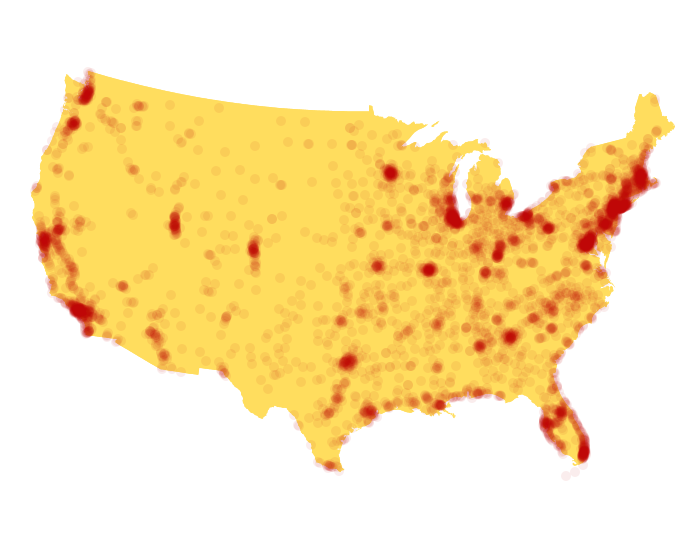
Density maps and Dot maps made by plotting points.
-
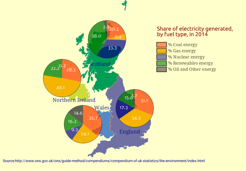
Pie chart maps visualize how much each category takes from the total amount.
-
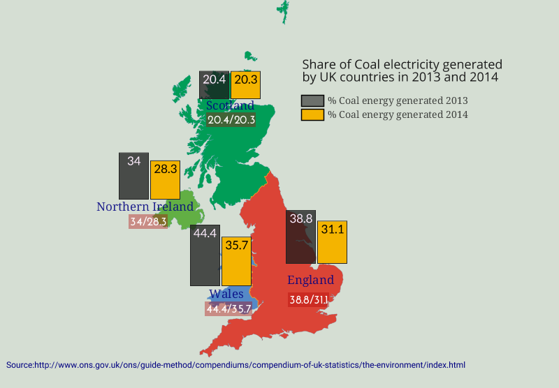
Columns chart maps are being used to visualize data category change.
-

Multiple symbols maps visualize the differences in the magnitude of data.
-

Maps using Symbols with proportional size to the values of the attribute being mapped.
-

Pinpoint maps use markers to visualize the exactly location of some data such as events on a map, being used for analysis and presentations.
-

Street level maps created by taking snapshots of the Esri map tiles.
-

Create enganging Infographics based on geographic maps.
-

Create quick and easy maps for any project or website, to illustrate information.
-

World outline maps made with a geographic projection.
-

World outline maps made with a random pattern.