How to Make a Geographic Heatmap in 7 easy steps
What is a Heat Map?
A heat map (usually spelled heatmap) is a graphical representation of data where values are illustrated by color.
Geographic heatmaps (also known as Color maps or Choropleth maps) use a sequential color scheme to provide an easy way to visualize how the measurement data or the statistical data varies across a geographic area, or administrative units.
For this presentation we are going to use the Map Grafica online editor - in the browser. If you would rather make your heatmap programmatically, check out Nathan's solution on flowingdata.com.
Prepare your data
By far, this is the most difficult step. You will need to find and prepare data in a tabular, two columns format: the division ID and the Value.
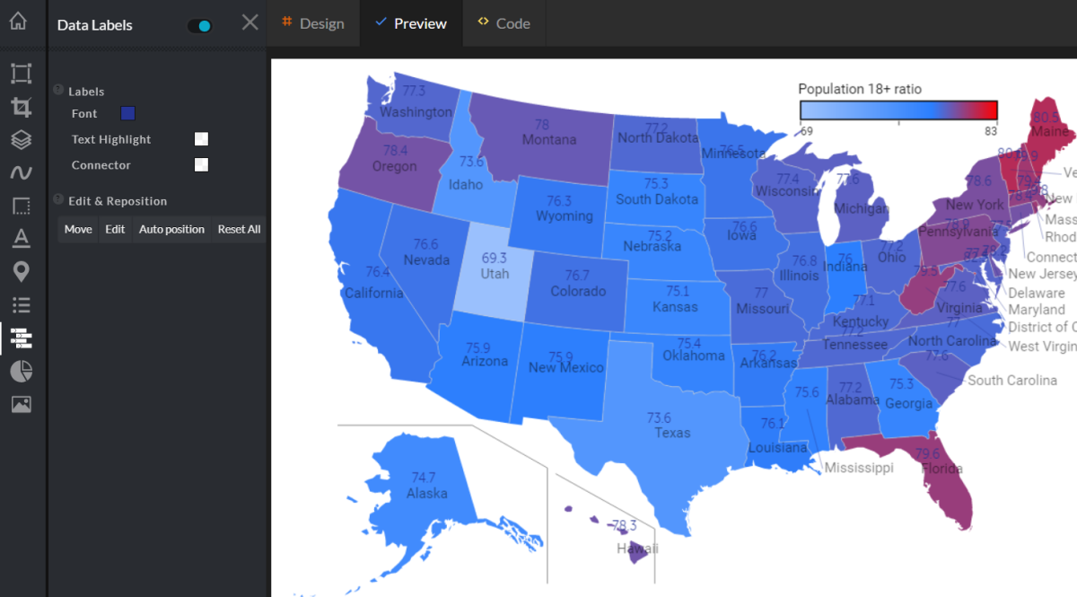
We will use US Census data to identify which States have the Oldest Population, and which States have the Youngest Population; and how they are distributed throughout the United States.
After we download the Population estimates by age (18+) data set - 2014, we prepare a tabular format file in MS Excel, and select the two columns of interest.

Create a map design
I use my Chrome browser to open the editor and locate the US geographic map templates.
For our design I chose the Lambert projection - with Alaska and Hawaii moved and resized.
In this template each state is a map Division identified by a Code.
From the "Style" menu, I am going to set a white background, and from the "Canvas" menu I set the map design size to: 1200 x 900 pixels.
Load and validate your data
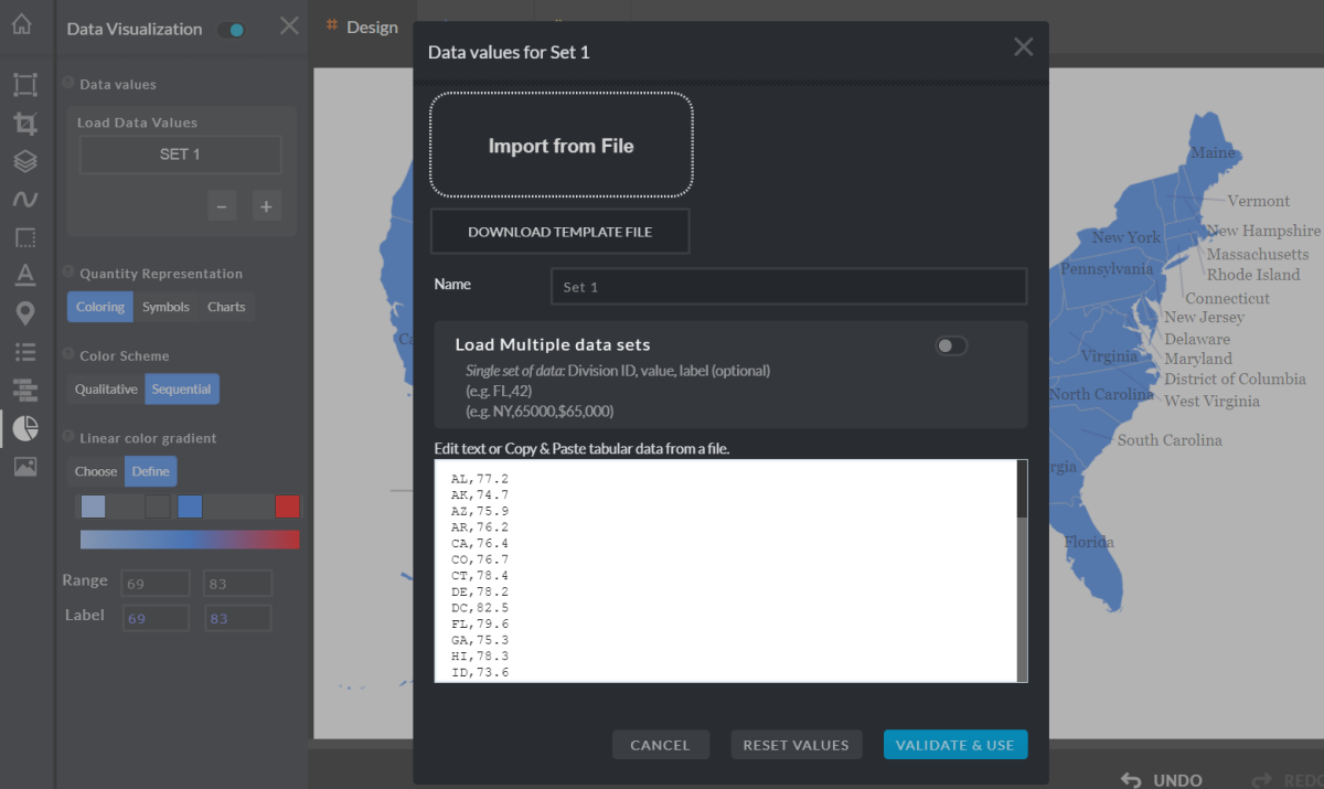
After we enable the "Data Visualization" feature, we copy the two columns from the spreadsheet and paste the content into the "Data Values" dialog.
Once we click on the "Validate & Use" button, each division on the map will have associated the data value from the spreadsheet.
When we enable the "Data Labels" feature, the values are being displayed on the map, along with the division label (State name).
Setup the heatmap design
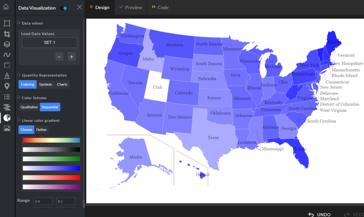
At this step we choose to visualize the data using coloring, with a sequential color scheme.
The editor has a number of predefined sequential color schemes, based on a linear gradient with one primary color.
Because none of these schemes match the design we had in mind for our storytelling, we'll be creating our own coloring scheme.
Create a sequential color scheme
We'll build a color scheme based on a linear gradient, that blends colors from one point to another in a straight line.
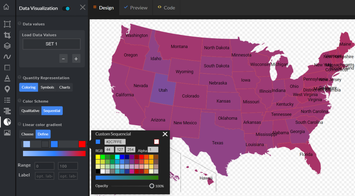
To define the linear gradient, we start by choosing the start color and the end color.
For our presentation, the start color - light blue - corresponds to the State with the youngest population, while the end color - red - corresponds to the State with the oldest population.
If we want to represent the median values with more distinct color shades, we can choose one or more stop colors between the start and the end.
After trying different colors for our heatmap, I have decided to use a brilliant, light cobalt blue for the median color.
Set data values range
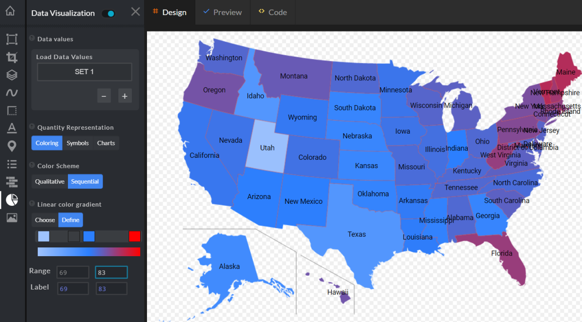
The editor will try to determine the optimal values range by extracting the minimum and the maximum values, but I will manually adjust the Range values to make the visualization more readable.
Here is a simplified function to calculate the color used to fill a shape, based on its Division data value:
function calculateShapeColor(colorStart, colorEnd, rangeMin, rangeMax, dataValue){

	var ratio = (dataValue - rangeMin)/(rangeMax - rangeMin);
	var R = (colorStart.R + (ratio * (colorEnd.R - colorStart.R)));
	var G = (colorStart.G + (ratio * (colorEnd.G - colorStart.G)));
	var B = (colorStart.B + (ratio * (colorEnd.B - colorStart.B)));

	return Color(R, G, B);
}
When I extend the Range Min and Max values, the calculated colors will become closer to each other, and reverse - when I limit the Range values, each shape will be painted with a more distinct color.
Add extra features to the map design
Finally, I add a few more features to our design, including a "Legend", and displaying "Data Labels" - the data values - above the State names.
You can edit this heatmap yourself, to see how changing the Sequential Scheme colors and the Range values would affect the design.
For some interesting insights into why some States might have a larger proportion of residents over age 65, check out insurify.com Insights.
For more map visualization ideas, check out the data visualization map types on the mapgrafica.com website.
