Map Grafica Tutorial
What is Map Grafica editor?
Map Grafica is an online tool for creating Data Visualization Maps and Designs based on Maps, with thousands of shape templates.
As you work on a Data Visualization Map design, instant previews are available in the browser, with the option to save/download the visualization as a PNG image or the JSON source file for reuse.
The main steps to create a visualization map:
- Search or Choose a shape template
- Choose a projection
- Enable data visualization
- Load data sets
- Choose representation type and create categories or a sequential color scheme
- Create and adjust data value Ranges
- Preview and save the final image or the design code file
Optional steps to update the visualization map design:
- Enable Locations, add cities, load data points, or/and add points on the map
- Update the design style and background
- Update the canvas size, position map
- Enable Outlines and Borders
- Enable and style Labels
- Add drawings, Text or Images
Get started with a new design
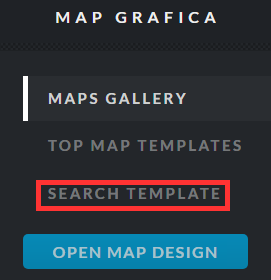
You can create a new design by searching for a shape template (the map with divisions: countries, states, counties, etc.)
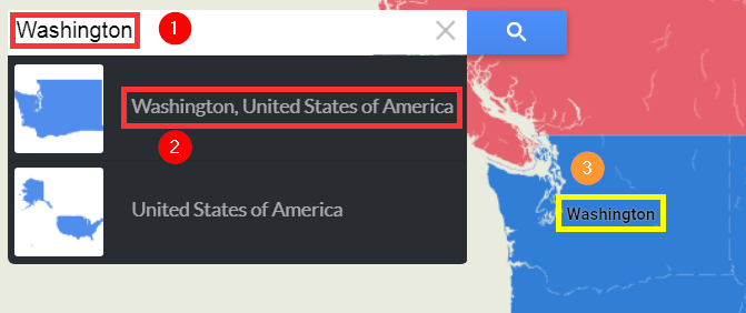
On the navigation screen, enter a search name (1), or navigate the map and click on a Label (3), then confirm the map you want to use (2).
On the next screen -- choose the map type (just outline, divisions or sub-divisions), and the map projection.
Optionally - set a different canvas size than the default value.
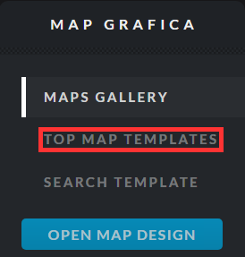
Some of the most popular templates are found in the "Top Map Templates" view - you'll just need to select one of them, to get started.
Reuse an existing design
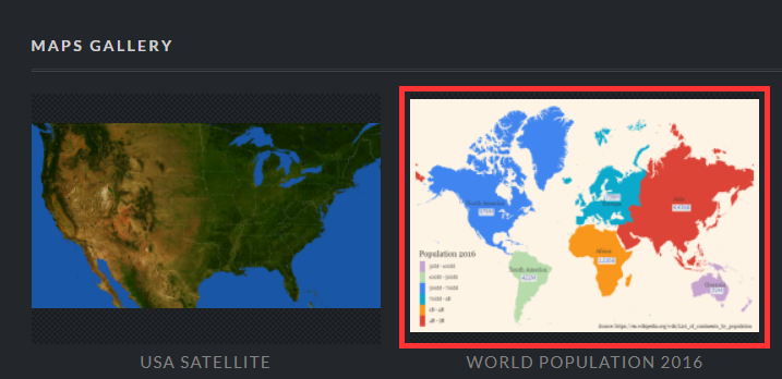
We maintain a gallery of interesting maps -- you can reuse one of them.
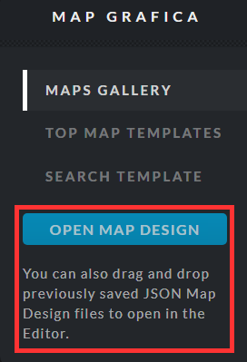
Or you can upload one of the design files you previously saved on your laptop.
Load and validate your data
After you enable the "Data Visualization" feature (pie shape button), you can copy the two columns from a spreadsheet and paste the content into the "Data Values" dialog.
The two columns are the division ID (A) and the division Value (B). The division IDs are: State (or Province) ID for a Country map, Country ID for a Continent map, or County ID for a State map, etc...

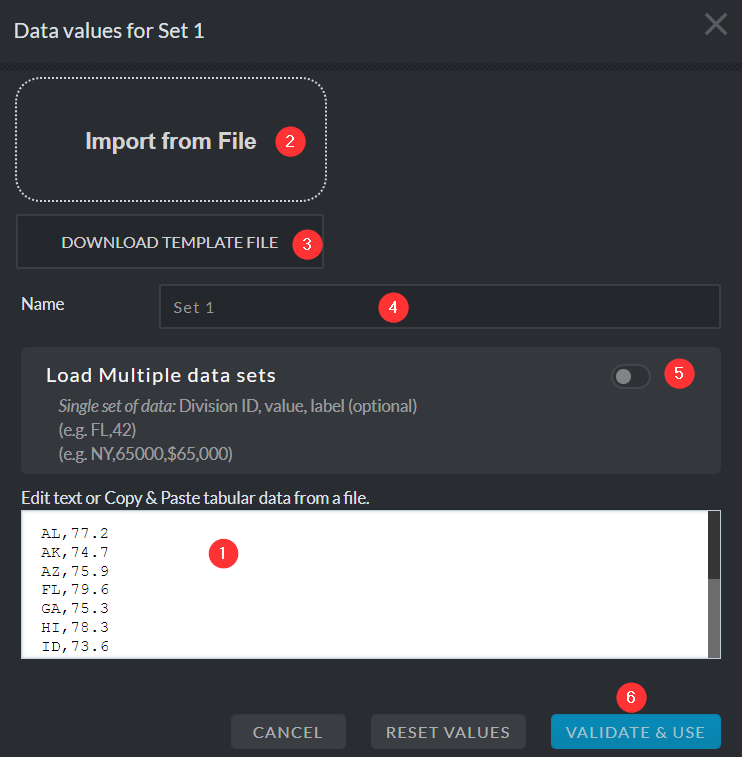
You can edit the dataset directly in the editor (1), or import from a file in CSV format (2). A sample CSV file with Divisions IDs can be downloaded from editor (3).
For advanced users, you can set multiple data sets in the CSV file (5) - 1st column is the division ID, the 2nd, 3rd, etc. are the values for each dataset.
When working with multiple data sets, you can edit the set name (4).
Setup the visualization mode, Create a sequential color scheme
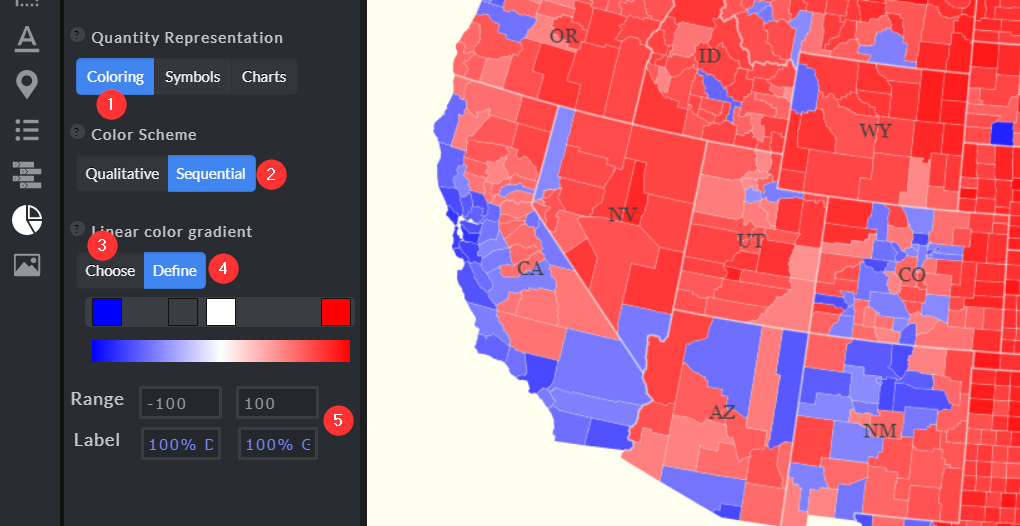
When you choose to visualize the data using coloring (1), with a sequential color scheme (2) - you can select a predefined sequential color scheme (3), or you can create your own coloring scheme (4).
The next step is to create a Data Values Range (5), including labels that will be shown on your map Legend.
The Range Min and Max values should correspond to the extreme values from your data set.
You can design your visualization with other Representation modes: Symbols and Charts, which can be used with multiple data sets.
Preview and save your design
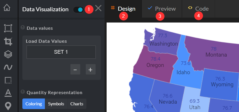
While you are working on the map design - you should use the Design view (2).
To preview the design final image - you should use the Preview (2) section.
Advanced users can directly change the design by updating the JSON code (4).
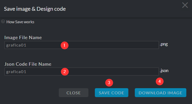
Before saving your design, you can edit the default file names. The files will be saved to your browser default download folder (CTRL+J).
The image file (1) in PNG format (4).
The source code file (2) in JSON format (3). You can use this file to start a new design, or share with others, or even edit it manually - and load it back in the mapgrafica editor.
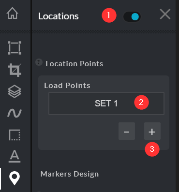
Add Locations & Data points
You can add sets of Data Points by copy & paste or import a worksheet file in CSV format.
(1) Enable Locations
(2) Open the Data Set import & edit dialog
(3) Add more Data Sets
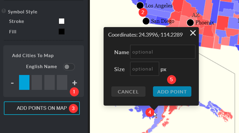
Or you can enable Cities (1) - ordered by population (2),
or add points (3) by clicking on the map (4) and confirming the coordinates (5).
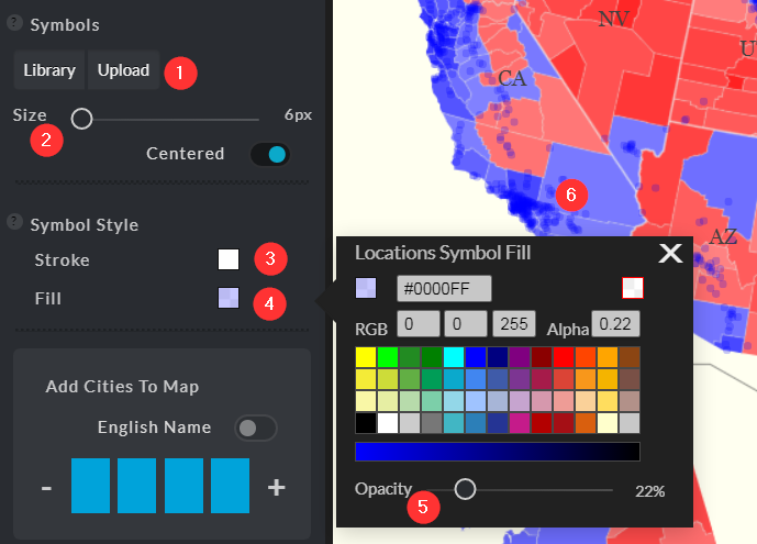
When you have a large number of Locations, you should refine the default location symbol - that is a black circle with a white outline (1).
(2) Reduce circle size
(3) Set Stroke color fully transparent, or size zero
(5) Set transparency for the fill color (4).
For more map visualization ideas, check out the density maps and dot maps visualization types on the mapgrafica.com website.
Style your map design
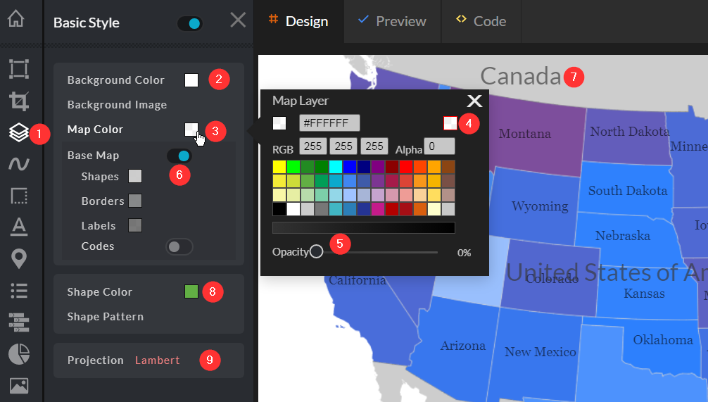
The editor has many features that you can use to give your design the best appearance.
(2) Set Canvas background color
(3) Map color should be set fully transparent (4) when you use a base map.
(5) Enable the Base map. For example, the base map is the continent map for a country, or the country map for counties map.
(6) Display the base map in neutral colors, as well as for the labels (7).
(8) Set default shapes color when not using data visualization - with coloring representation.
(9) Change the map projection - choose the projection that best suits your design.
Update Canvas size and position the Map
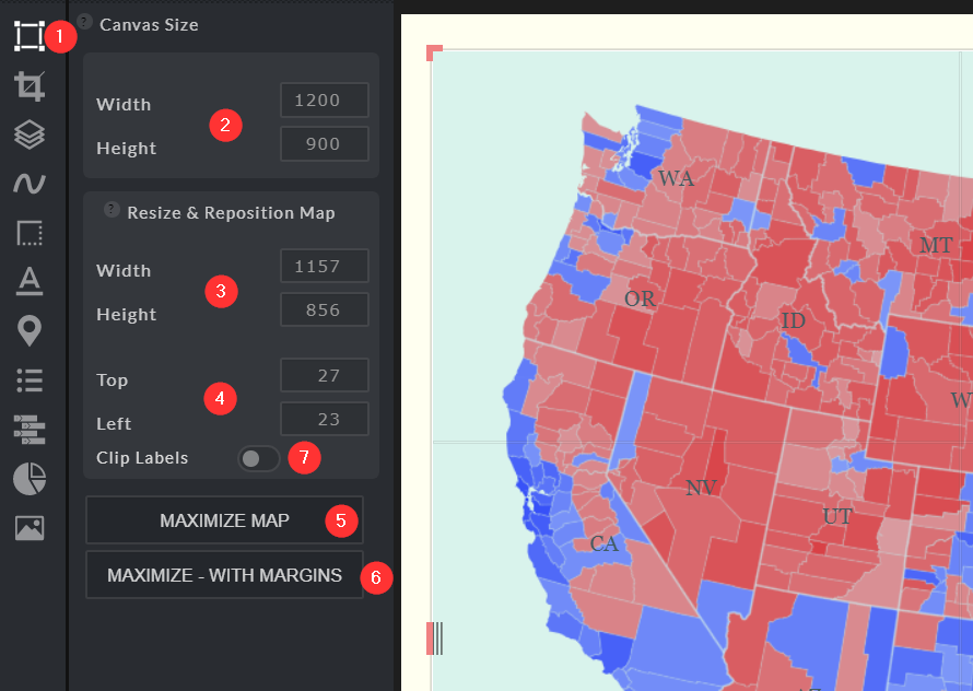
The Map is a layer placed on a canvas. Its dimension, position and background color can be set independently of the canvas.
(1) Open Toolset
(2) Set canvas width and height
(3) Set Map width and height
(4) Position the Map on the canvas - you can also drag & drop, and resize it using the handlers
(5) Maximize the map within the canvas
(6) Maximize the map but keep a thin margin all around it
(7) Enable "Clip Labels" to avoid the labels being painted outside the Map area
Borders and Outlines
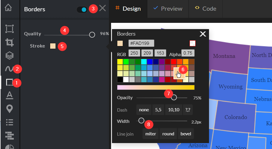
Enable "Borders" (1) to have lines painted between division shapes, or/and enable "Outlines" (2) to have lines painted around shapes.
(4) The quality of the lines can be reduced, to achieve a smother contour - it works well for outline maps
(5) Style lines use to pain the Borders and Outlines
(6) Choose a color that best matches the design
(7) Set a transparency level to increase the blending between shapes
(8) Increase or reduce the line width. Click "Width" label to set it to zero.
Style Labels
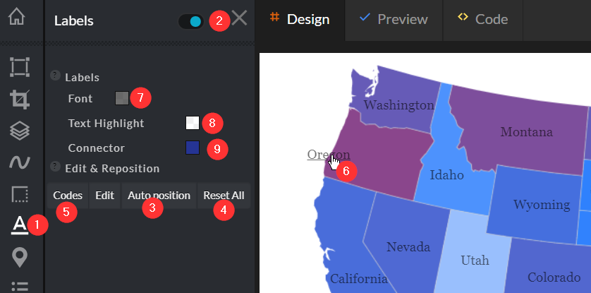
Enabling Labels (1) works well when the Map has a limited number of shapes - divisions.
(2) Enable Division labels
(3) Let the editor find the best position for each label, to prevent labels from overlapping
(4) Reset the labels position to the center of each shape - Division
(5) Display Division Code instead of the name, for example: "CA" instead of "California"
(6) Individual labels can be positioned and resized manually
(7) Set the font style
(8) Set labels background
(9) Set the style for label connectors. A connector is displayed when the label is moved away from shape's center.
Add drawings, Text or images
The design can be enhanced with images, text or/and drawings.
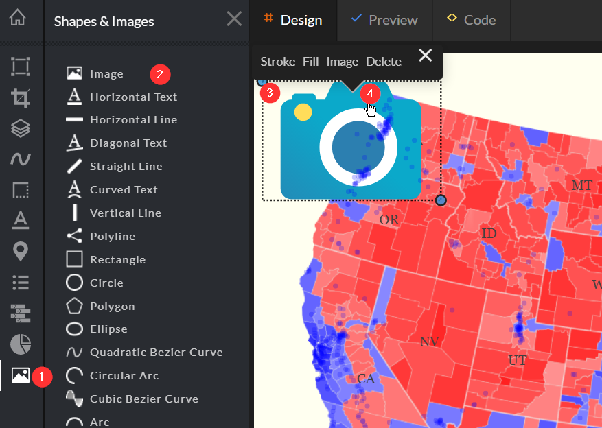
To add an image for example, follow these steps:
(1) Open Toolset
(2) Select "Image" button
(3) Click the top-left position on the map design, and then the bottom-right corner
(4) Click the "image" area to open the context menu
Select "Image" link and then upload/or drag-n-drop an image file from your device
Resize & move the "image" with the blue circle handlers (3).
Cannot figure out how to use some of the editor's features? Ask us
