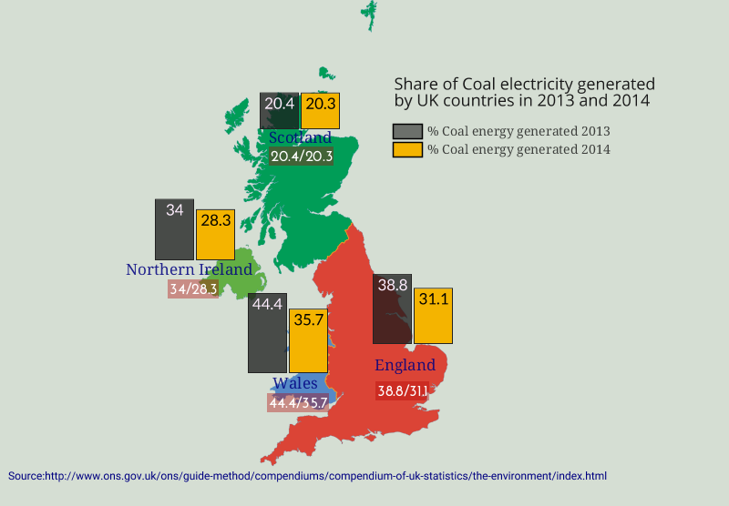
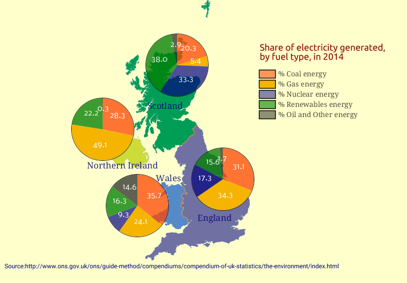
Chart maps, Pie and Column maps
Chart maps are used to visualize multiple data sets summarized by area, or administrative units. Using charts, a map can show patterns of quantities and categories in the same time.
Pie chart maps can show how much each category takes from the total amount.
Pie chart maps can show how much each category takes from the total amount.
Columns chart maps can show how much each category has increased or decreased over a period of time.