How to Make an Election Results Map
What is an Election Results Map?
Election maps can display a variety of stories, based on the data sets used.
"An election is inherently a spatial phenomenon, and we want to know how we voted relative to our neighbors and relative to people across the nation," says Kenneth Field, a cartographer at Esri, a mapping software company based in Redlands, California.
For this presentation we are going to use the Map Grafica online editor - in the browser. If you would like to try making your election map programmatically, you can start by checking out Lo Bénichou blog.
Prepare a Data Set
Regardless of the tool you use, you will need to find and prepare data in a tabular file: the division ID and the Value.
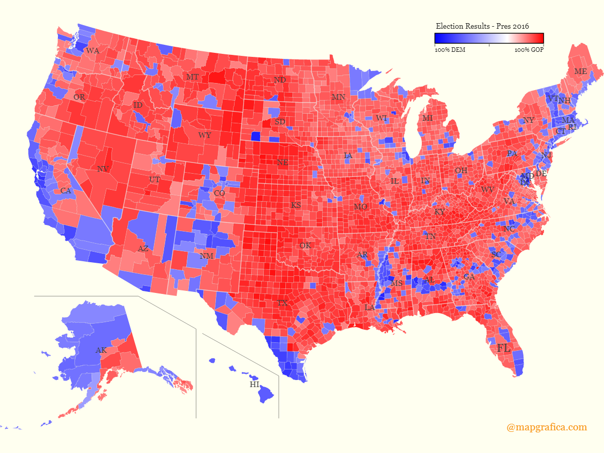
For the following map, we will be using the 2016 Presidential election data from Tony McGovern, who scraped the data from Townhall.com. I have updated the Alaska results based on RRH Elections - Alaska Results by County Equivalent, 1960-2016.
After I downloaded the Excel file, and fixed Alaska Results by County Equivalent, I had to decide what column to use to represent the Value for each County (division ID).

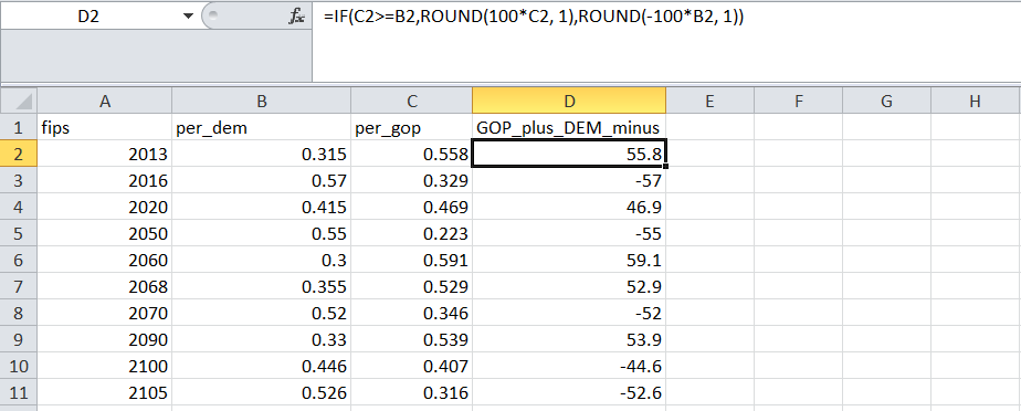
The Tabular file has two columns of interest: Percentage won by Democrats and Percentage won by GOP.
Because I'll use only one data set with County ID - County Value, I have created a formula in Excel. This formula produces a 3rd Column - with positive values for Counties where GOP won more votes than Democrats, and negative values for Counties where Democrats won more votes than Republicans.
	D2 =IF(C2>=B2,ROUND(100*C2, 1),ROUND(-100*B2, 1))
	C2 - GOP Percent value;
	B2 - DEM Percent value;
Create a map design
We use the Chrome browser to open the editor and locate the US geographic map templates.
For our design I chose the Lambert projection - with Alaska and Hawaii moved and resized.
In this template each County is a map Division identified by a Code.
From the "Style" menu, I am going to set a white-yellow background, and from the "Canvas" menu I will set the map design size to: 1200 x 900 pixels.
Load and validate data
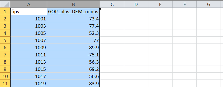
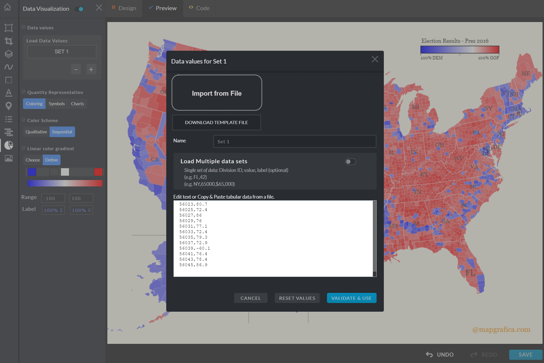
After I enable the "Data Visualization" feature, I will copy the two columns from the spreadsheet and paste the content into the "Data Values" dialog.
Once we click on the "Validate & Use" button, each division on the map will have associated the data value from the spreadsheet.
Setup the map design
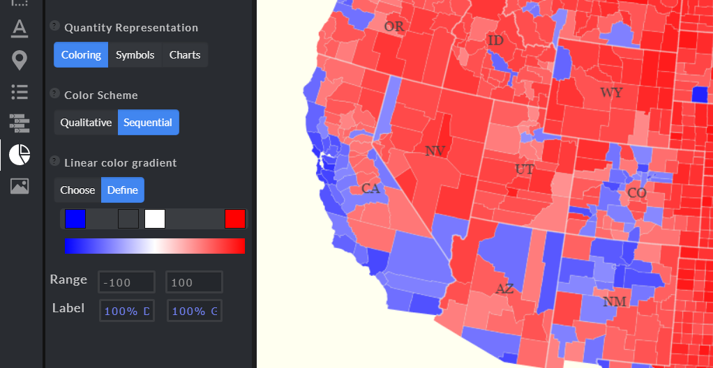
We chose to visualize the data using coloring, with a sequential color scheme.
We'll build a color scheme based on a linear gradient, that blends colors from one point to another in a straight line.
To define the linear gradient, we start by choosing the start color and the end color.
For our presentation, the start color - blue - corresponds to the County with the highest percentage of votes won by Democrats (Clinton),
while the end color - red - corresponds to the County with the highest percentage of votes won by Republicans (Trump).
We use a stop color - white, between the start and the end.
The blue-white shade will correspond to the Counties won by Democrats less resoundingly, while red-white shade corresponds to the County with the least percentage won by GOP.
Set data values range
The editor will try to determine the optimal values range, by extracting the minimum and the maximum values, but I will manually adjust the Range values, and set labels that will be shown on the legend.
We use the Range Minimum value -100, which would mean that the County won by Democrats with 100% of the votes,
and a Range Maximum value of 100, which would mean that the County won by Republicans with 100% of the votes.
Add some more features to the map design
Finally, I add a "Legend" and a watermark - using "Drawings" - Horizontal Text element.
You can edit this Election Results Map yourself to see how changing the Sequential Scheme colors and the Range values would affect the design, or you can enable Locations (Cities), or even create a custom dataset to present your own storyline.
To explore more options and techniques to make election results data maps, check out Kenneth Field blog.
For more map visualization ideas, check out the data visualization map types on the mapgrafica.com website.
